

Campaign Reporting
Designing a new reporting system for a new product feature - Influencer campaigns. A system that functionally organized all facets of a campaign’s performance, and simultaneously did so in a compelling way that delivered meaningful value against the high dollar budgets Fohr clients were spending.
TIMELINE
Nov 2018 - Jan 2019
ROLE
Product Designer
TEAM
Principal Designer - Rich Tong
Product Designer - Julie Piciatie
Developer - Camron Bosh
FUNCTION
UX Strategy
System Design
Visual Design
CONTRIBUTION
UI Design, Motion Design, Infographics

Press play for a walkthrough
Campaign managers have a hard time recording and referencing influencer data. This is tracked via emails, excel sheets and tables. They have built a influencer content repository for each client but their main frustration lies in time spent gathering and searching for the relevant images/ data pools. Calculating the engagement rate and manual influencer classification is tedious and us susceptible to human error.
Through multiple user interviews and competitive research findings were came to the conclusion that the impressions, engagement rate & benchmark comparison was the main data sets to be represented. The MVP product wires were tested and surveyed to understand how this data can be compared against other campaigns. I worked rigorously with the development team to test and understand the back-end data structure how it can be plugged into the page features and successfully showcase the infographics.
Overview
Impact and Outcome
This new reporting system boosted overall campaign efficiency, particularly for campaign managers.
With a comprehensive showcase of campaign performance (data and pictures), there was a 37% decrease in candidate analysing time.
Benchmark comparison and engagement analysis proved to be the most referred to KPIs to measure the success of campaigns and influencers.
Tracking the audience demographic helped indicate micro clientele for influencers and Fohr.
MVP+ could withhold analytical tools categorising targeted audience pools/emerging markets.
It would be great if the next development cycle focused on accessibility and legibility for all UI elements.
Infographic Explorations


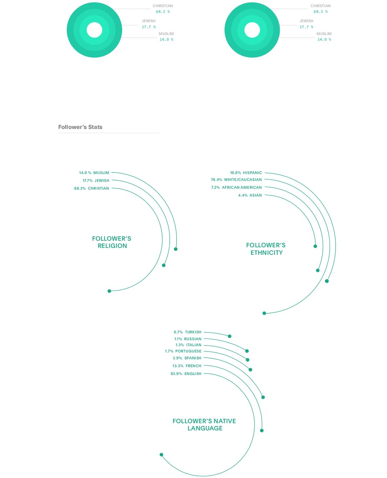


Understanding and experimenting with different styles of representing data collected while formatting campaign reports. We decided to eliminate the condensed card formatted interface as campaign directors preferred an outlook that showcased all the information on the screen.


Dark theme GUI with the secondary color pallet to highlight graphs and numerals.
Final design direction
Top navigation directs the user to explore campaign content and view influencers involved in this campaign.
Profile cards showcasing the influencers involved in this campaign.
Influencer Profile snap shot
Users can filter through all campaign content
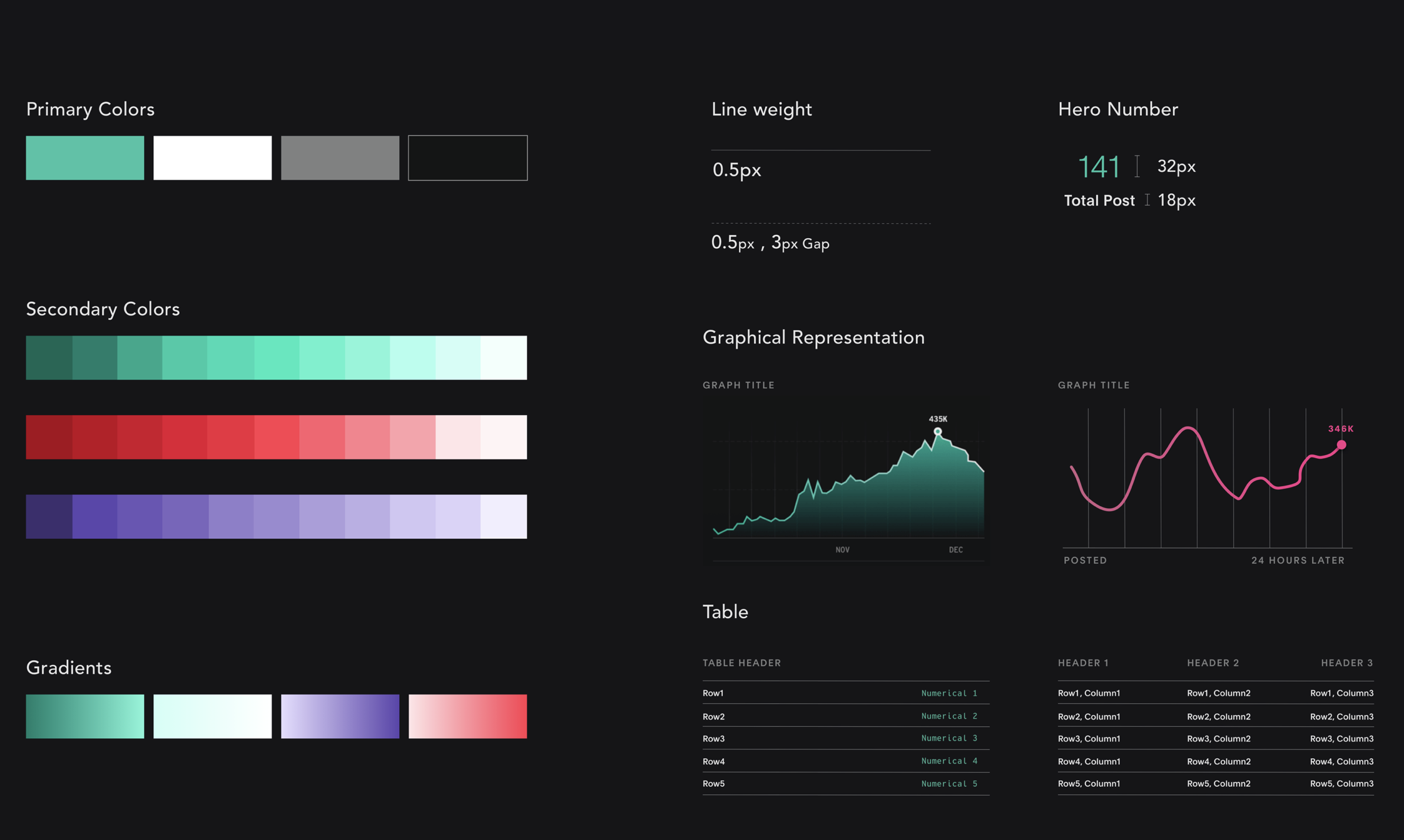
Graphical and color additions to the Design Library.


